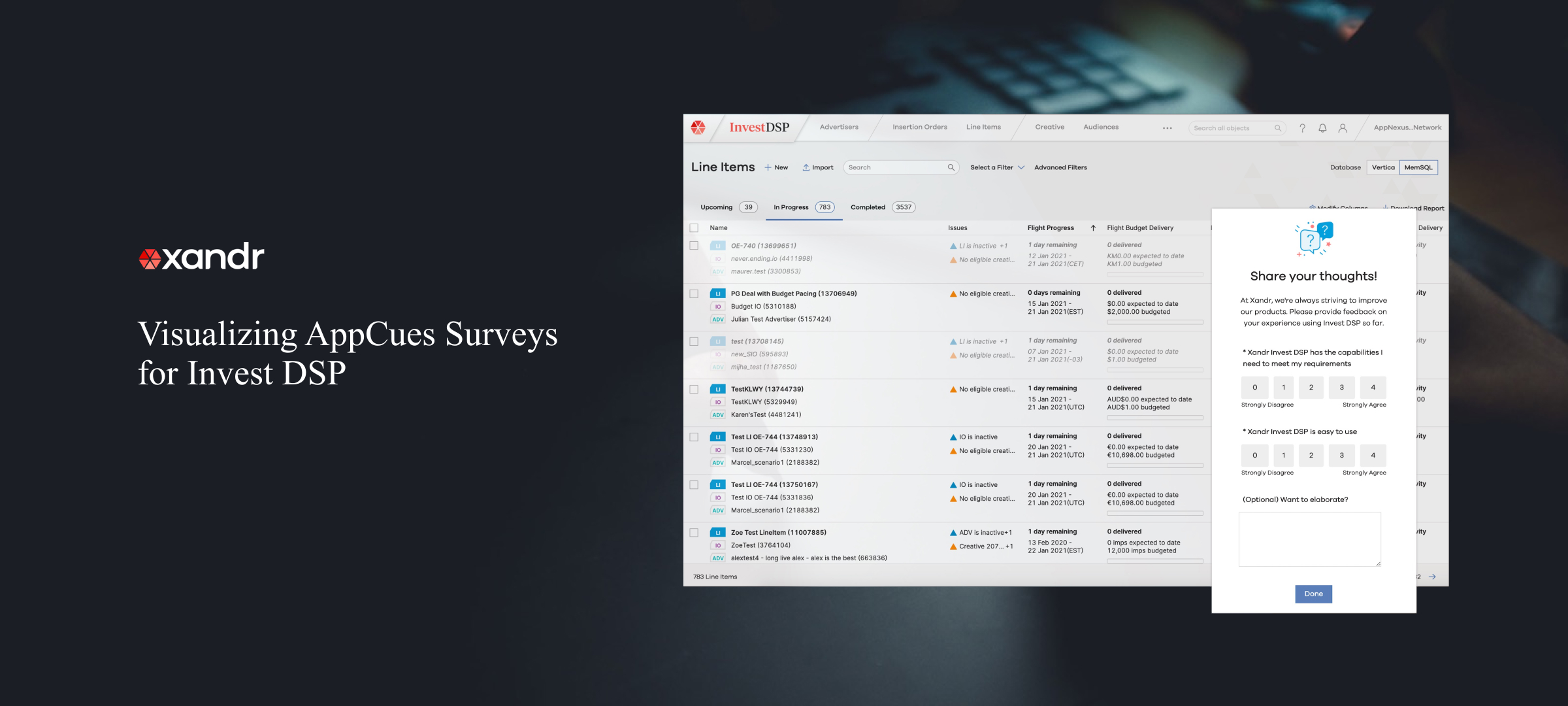
I teamed up with our UX Researcher and UI Designer to design a data visualization template that analyzes AppCues surveys in Xandr’s DSP.
Though initially implemented for DSP, this AppCues survey is expected to be adopted by Xandr’s SSP and TV platforms in the future.
My Role
Lead Designer and Prototyper
Tools
Sketch, Invision, D3.js, React.js, HTML/CSS, pen & paper
Team
Myself, UX Researcher, UI Designer
Duration
Q4 2020
Design Outcome
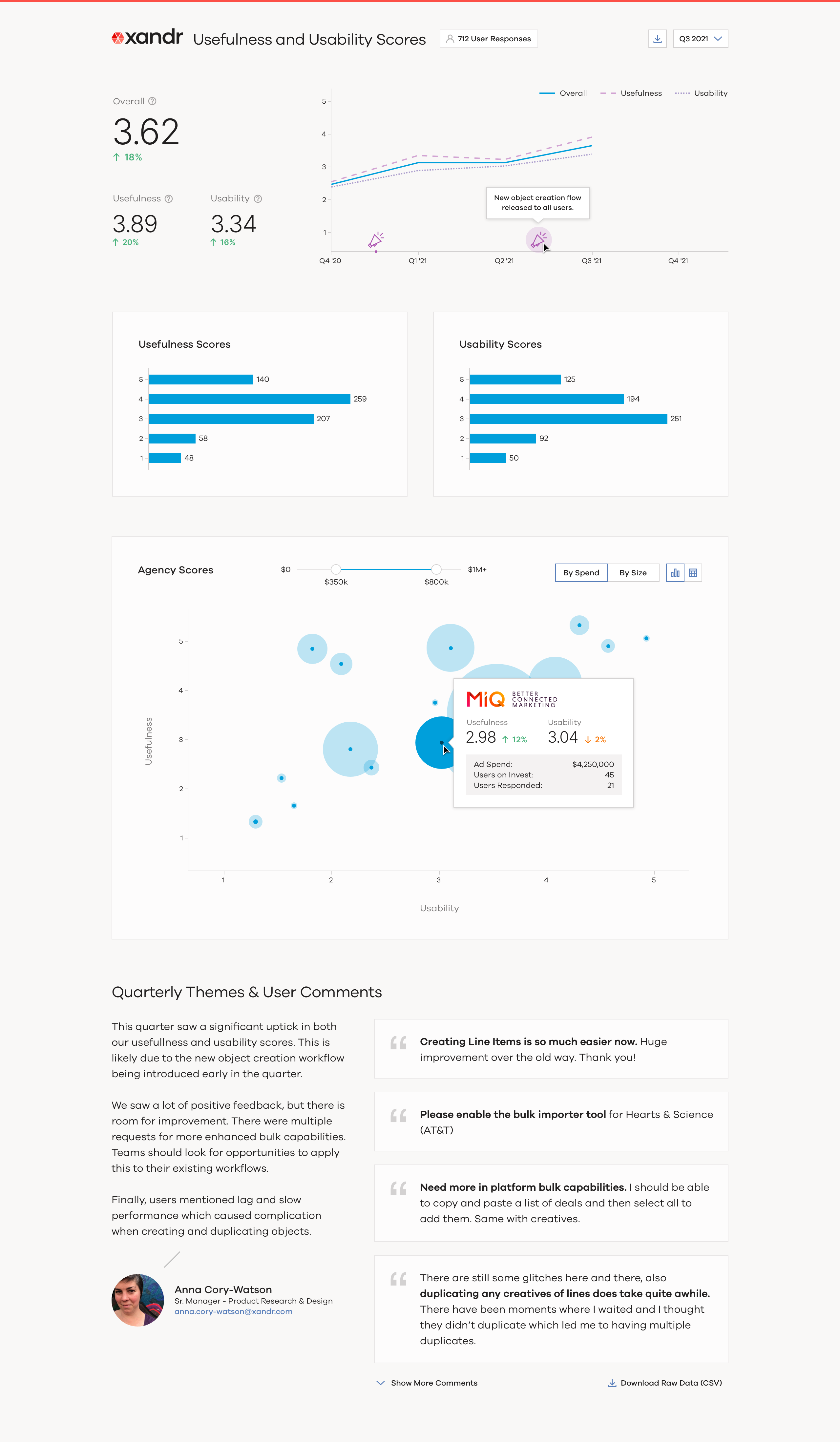
I helped the UX Researcher to design and develop an interactive data visualization template for showing user feedback on a quarterly basis.
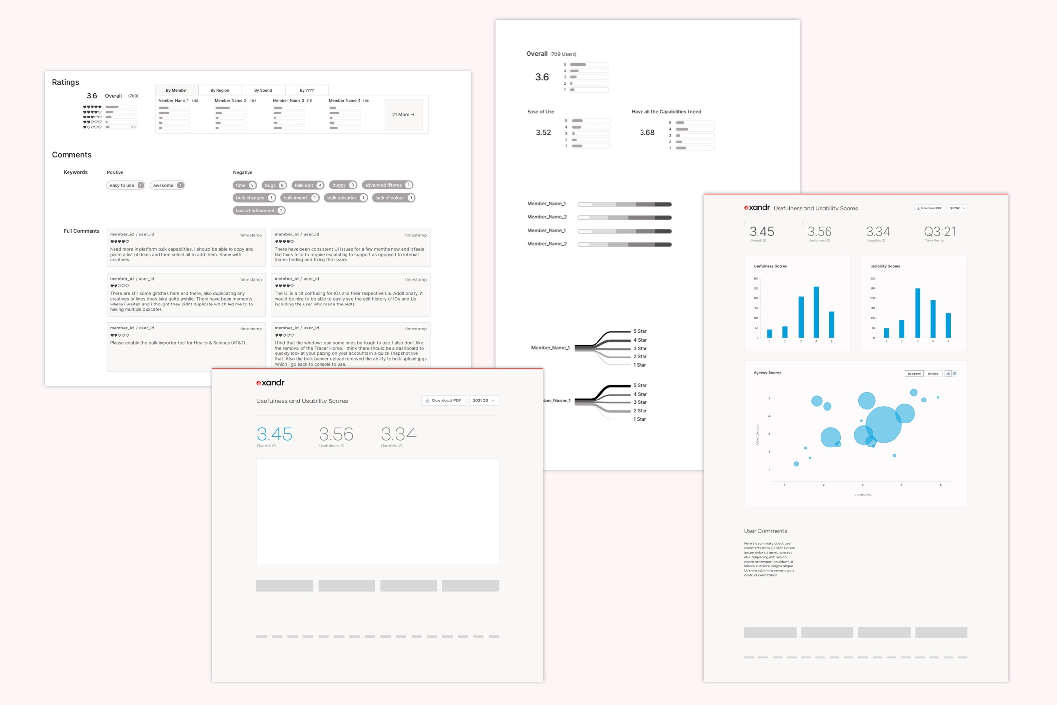
The visualization template consists for three main sections, and the graphs interactively shows user more insights of each metric.
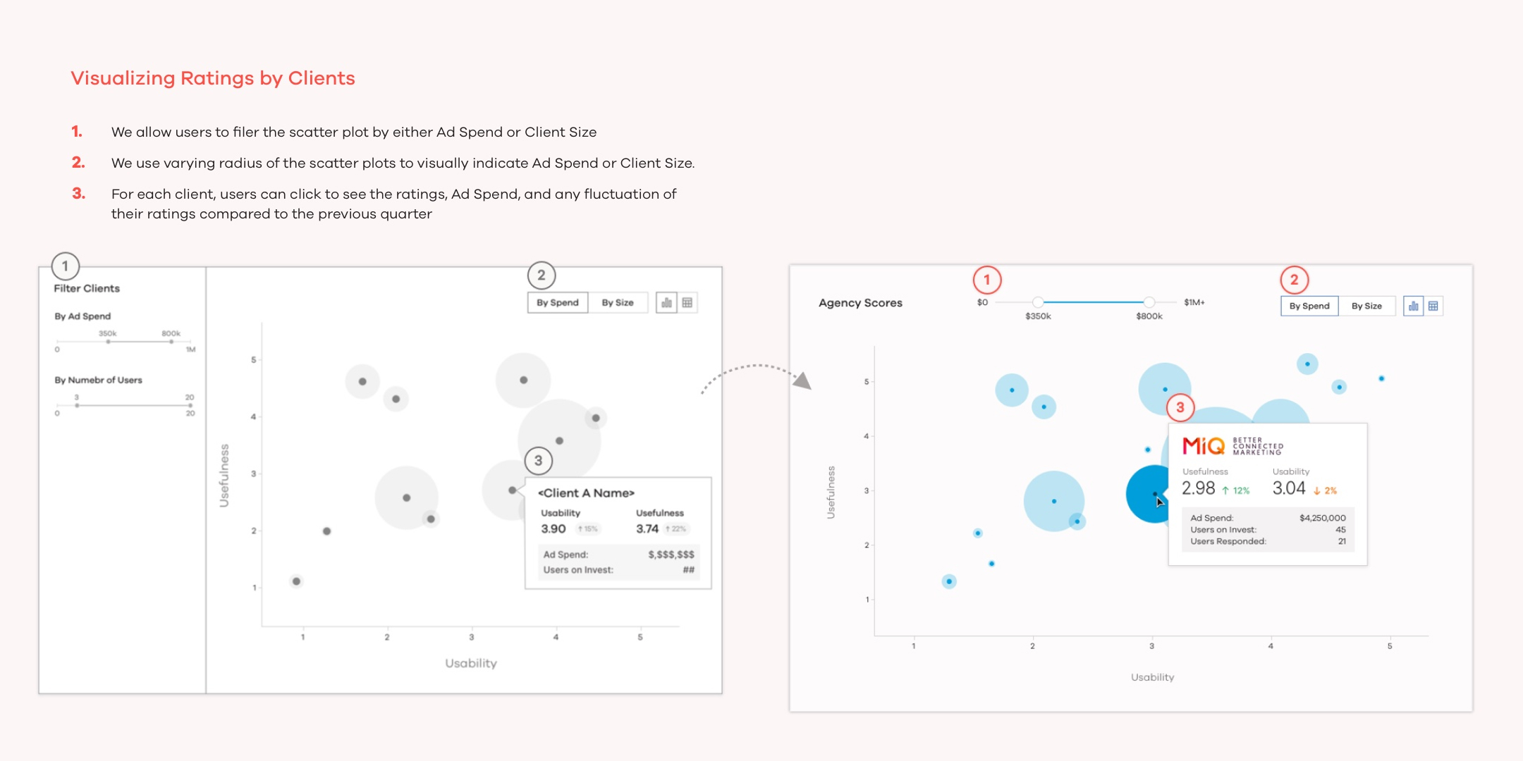
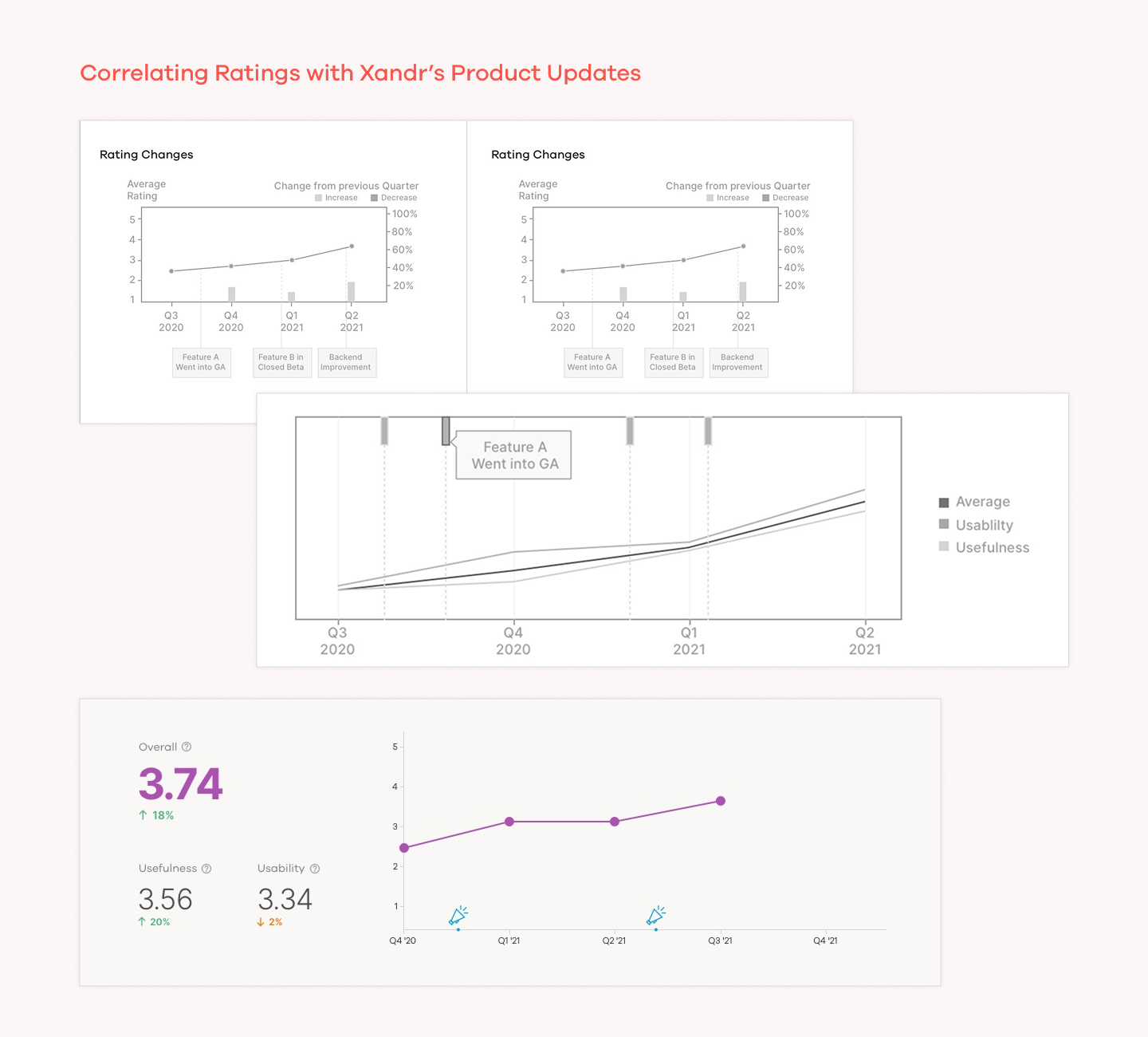
- The top shows a rating overview of the most recently quarterly ratings, accompanied by a line chart that correlates rating changes over time and when new feature or product updates are implemented in Xandr’s DSP.
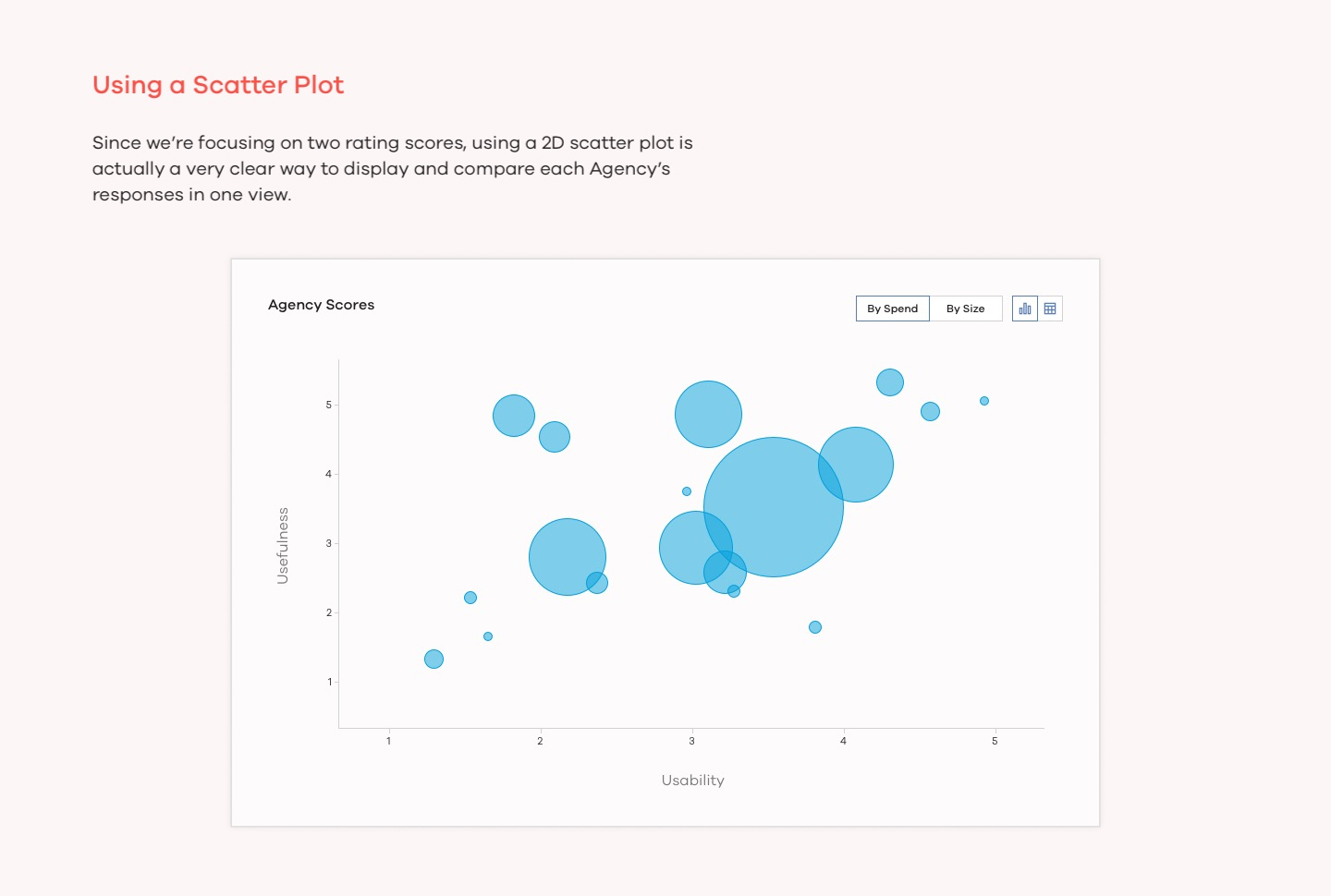
- The overall ratings are followed by horizontal bar charts and a 2D scatter plot, which gives details on the distribution of ratings for “Usefulness” and “Usability”, and their correlation with clients' Ad spend and size.
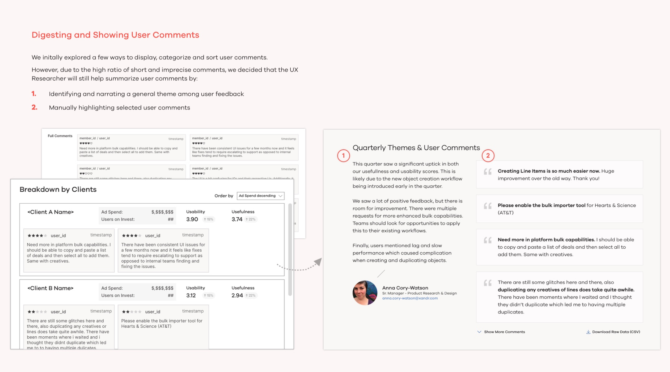
- User comments collected through the surveys are selected and curated by our UX Researcher. They are displayed at the bottom of the page to enrich the above quantitative visualizations above with qualitative insights.
AppCues User Survey Report - Default View
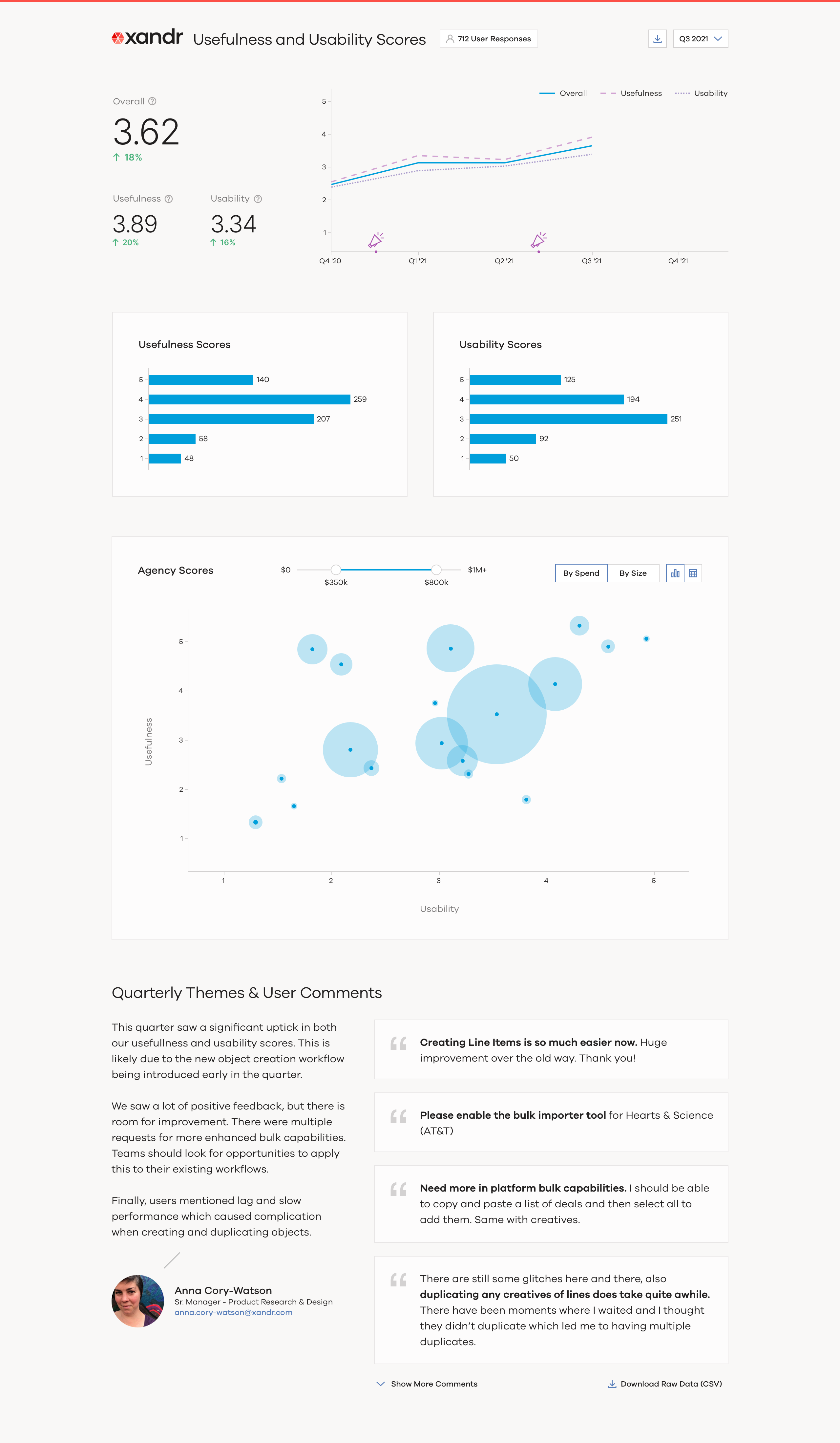
- Hovering over the megaphone icons shows corresponding event on the timeline, correlating product launches and feature improvements with the trends of user survey scores.
- Hovering over the scatter plot shows client details such as their ratings, ad spend, and how their ratings have changed over time.
AppCues User Survey Report - Mouse Hover
Research Process
Project Objectives
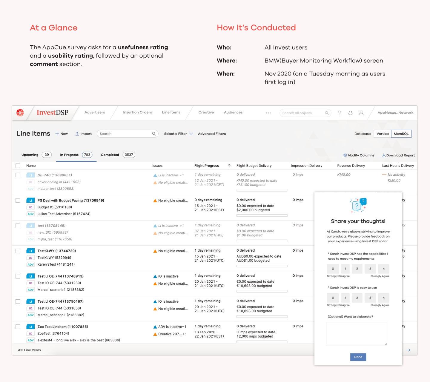
Xandr Invest is a newly launched DSP and as a design team we would like to collect user feedback not only from conducting interviews with selected Traders, but also through surveying a wide range of users.
The goal of this survey is mainly twofold: 1) measuring UX improvements and demonstrate to Xandr’s stakeholders, 2) help the design team analyze AppCues feedback and improve design
About The Survey
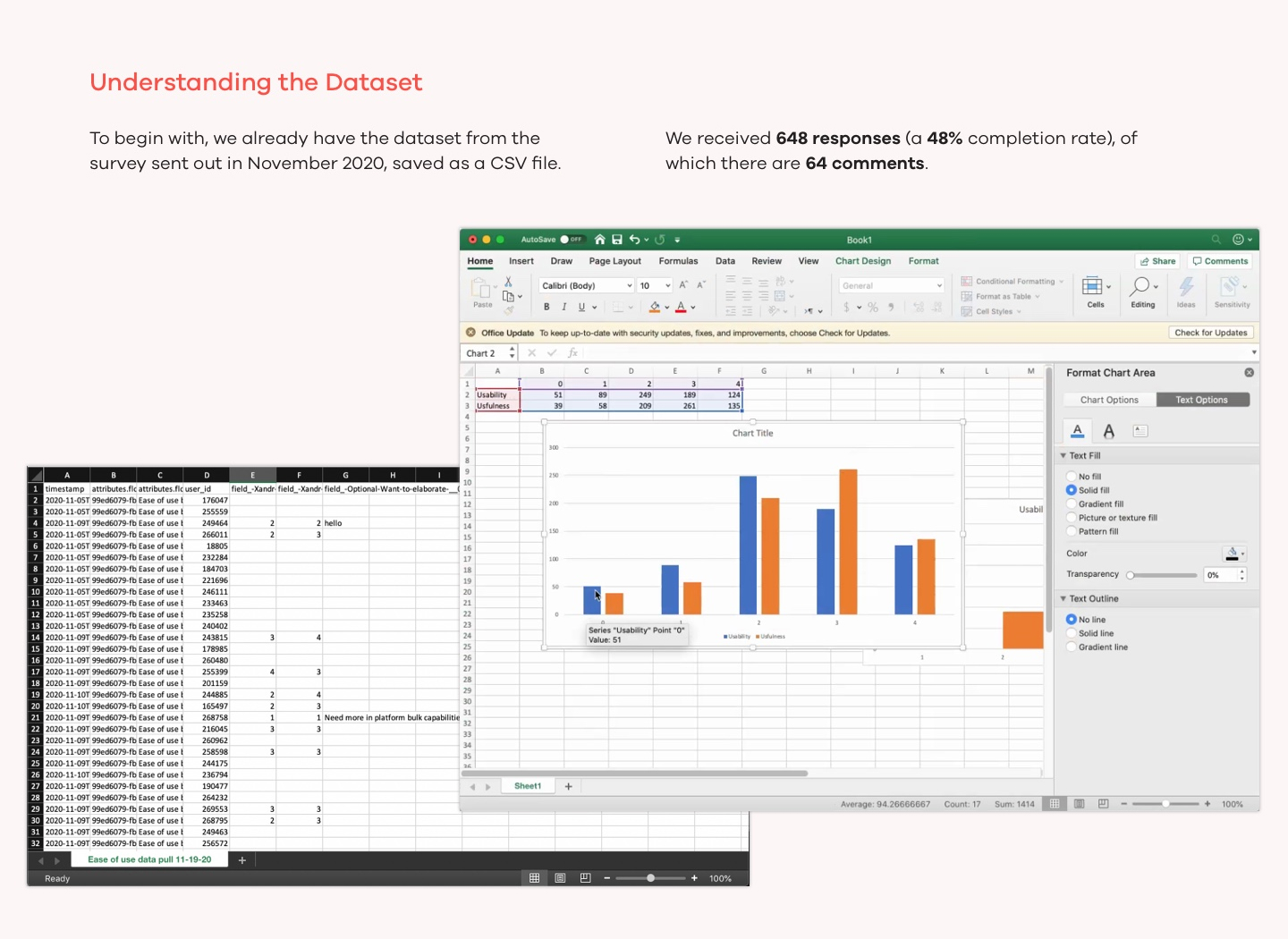
The UX researcher had launched a short AppCues survey that situate in the landing page of Xandr Invest. The survey was designed to be short and simple to complete, and consists of two ratings and an optional input field.
The survey had been set up and sent out for 2 months by the time I joined the project, and changing survey content is out of the project scope. This means l had to stay with the given two metrics discover and visualize insights.
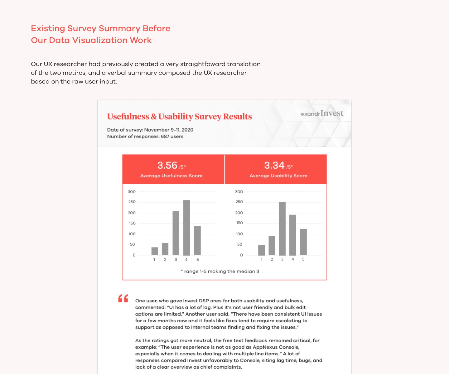
Prior to my joining the project, there had been some preliminary effort to visualize the survey in to a PDF format.
However, we believed that there could be more insights drawn from the survey.
Enriching the Dataset
I noticed that we had the opportunity to expand the dimensions of the existing dataset: even though it seemed that our survey only includes two ratings, we can use the “member ID” to associate the survey data with Xandr’s own client database and relevant metrics.
We can significantly enrich our data and insights by pulling in metrics such as company size, number of users on Xandr’s platform, current Ad spend, etc.
Design Process
Initial Exploration
We began by diving into all kinds of information what we can possibly get out of the survey and explored a variety of ways to visualize them.
Prioritization
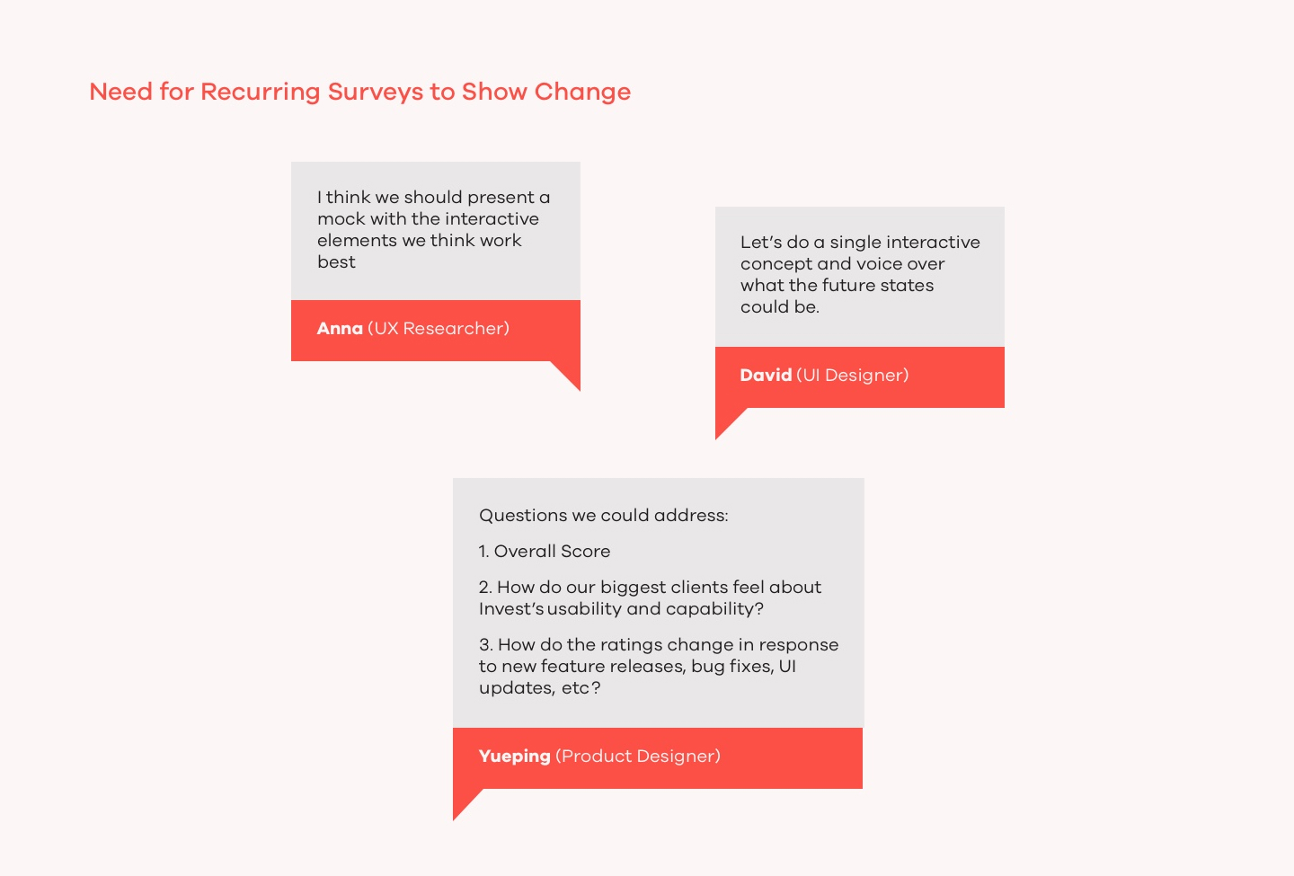
Our team met regularly during the design process to clarify the expected audiences of the visualization, and aligned on the short-term and long-term objectives for visualizing this survey.
We noticed that in order to show the impact the Product Design team makes, we need to conduct surveys over time to see how the ratings change. So while we have 648 initial responses, we need to design for the scenario of recurring surveys in mind.
Design Iterations
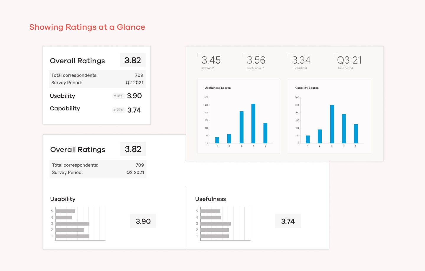
While we did a lot of explorations of charts and diagrams, we agree with the general idea that there should be an “at a glance” view of the survey result, followed by a breakdown of the survey if the viewer has more time to dig deeper.
Layout and Interactive filters
In the more detailed section, we want to show:
- How does our clients that have big spends feel about our product?
- How has the ratings changes over time, and what are some changes we made to the platform that might have affected the rating?